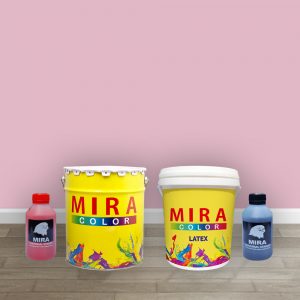
Powder Pink 666
Powder Pink 666 —a delicate and enchanting wall color that embodies the subtle charm of soft petals and gentle elegance.
This hue captures the essence of a gentle pink hue, reminiscent of the tender beauty found in powdered rose petals. It radiates a sense of serenity, bringing a touch of sweetness and sophistication to any space it graces.
Related products
-
Wall Color
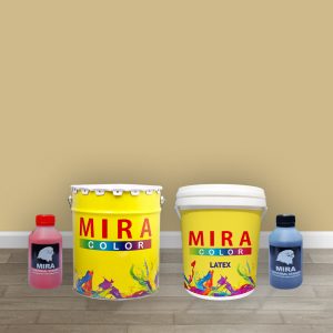
Cream 806
Cream 806 represents a harmonious blend of soft ivory tones, evoking a sense of tranquility and refinement. Its versatile and neutral nature makes it a perfect choice for those seeking to create a serene and inviting atmosphere in their space.
This classic color serves as an exquisite backdrop, seamlessly complementing various design styles—from traditional to modern and everything in between. Whether used to create a soothing sanctuary or to accentuate architectural features, Cream adds a touch of subtle opulence to your interiors.
-
Wall Color
Lilac 624
Lilac 624 — a wall color that encapsulates the delicate beauty and tranquility of blooming springtime flowers.
Lilac presents a soft and enchanting hue, reminiscent of the pastel tones found in fragrant lilac blossoms. This color exudes a sense of serenity and elegance, infusing your space with a touch of ethereal charm.
-
Wall Color
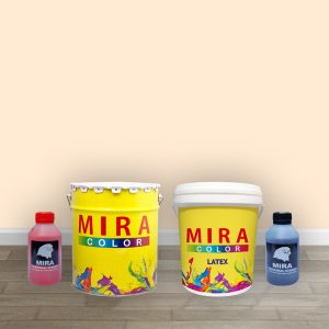
Pale Cream 834
Introducing Pale Cream 834—a wall color that exudes a gentle and inviting aura, reminiscent of the soft glow of candlelight in a serene setting.
Perfect for those seeking a serene and welcoming ambiance, Pale Cream serves as an excellent choice for bedrooms, living rooms, or any area where relaxation is key. Its soft tones create a soothing backdrop that effortlessly pairs with various decor styles.
-
Wall Color
Caprice 678
Caprice 678, our wall color, is a revelation of sophistication and depth, capturing the essence of refined luxury and understated elegance.
This unique hue embodies a fusion of rich, velvety tones that transition gracefully between muted greys and hints of celestial blues. Caprice exudes a sense of mystery and depth, inviting you into a world of tranquil sophistication.
-
Wall Color
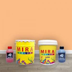
Clementine 395
Clementine 395, the wall color that embodies the radiance and zest of a sun-kissed citrus grove.
Imagine a hue that captures the vibrant spirit of ripe clementines at the peak of their sweetness—a fusion of warm, inviting tones that blend luscious oranges with a touch of golden sunlight. This color brings a burst of energy and warmth to any space it graces.
-
Wall Color
Bermunda Blue 451
Bermunda Blue 451 color is a fusion of rich blues, reminiscent of deep ocean depths, combined with hints of turquoise that evoke the shimmering hues of tropical lagoons. Bermuda Blue brings an invigorating energy, instantly enlivening any room it graces.
Whether you’re aiming for a coastal-inspired theme or seeking to infuse a pop of color into a neutral palette, Bermuda Blue effortlessly adds depth and character. Its bold yet versatile nature makes it an ideal choice for accent walls or an entire room, injecting a sense of adventure and charm into your home decor.